Archive for the ‘Colorbook’ Category

Statuses

m.e. chevreul’s color model

In 1,Colorbook,Experiments on February 11, 2010 by nameplace


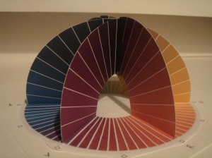
Michel Eugene (M.E.) Chevreul decided to create a system of color while head of dyeworks at a French textile manufacturer during the mid 1800s. Although a chemist by training, he became interested in the “optical composition” of color because inconsistencies and sometimes disharmonious color interactions in the textiles.

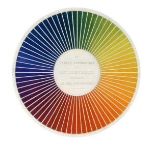
His model is based on 6 color zones: three for the primaries (Red, Yellow, Blue) and three for the secondaries (Orange, Green, Violet), with 12 segments in each zone. Chevreul supplemented his 2D model with a third dimension when he associated each segment with 10 levels of brightness. The purest colors are on the outside of the wheel (and the bottom of the hemisphere), while the darkest colors progress inwards and upwards.

Though incomplete, Chevreul’s model is nonetheless a helpful color reference. And not to mention a work of art in itself!

His 3 main discoveries: Successive Contrast, Afterimages (Simultaneous Contrast), and Mixed Contrast influenced the Impressionst movement, and Orphism, among others.

Here’s my derivative

Learn more about his work and the work of the other color theorists on this extensive site: http://www.colorsystem.com/

Articles

albers color value studies

In Colorbook,Experiments on February 11, 2010 by nameplace


Articles

analogous color schemes

In Colorbook on February 5, 2010 by nameplace


… identified by their dominant colors

greens, blues, violets

yellows, greens, blues

yellow-oranges, oranges, red-oranges

reds, red-oranges, oranges

reds, oranges, yellows

and the same object with minor lighting differences bring out different colors in it (what makes iridescent and reflective objects so incredible!)

this one is a bit cooler overall and leans more towards cyan

while this one is a bit warmer and is closer to green…

And I these examples show NEARLY analogous schemes. I don’t think they are exactly analogous since they both skip over red, and go towards magenta and red-violets.

in short, analogous color schemes are everywhere!

Articles

palettes…

In Colorbook on January 26, 2010 by nameplace


Articles

greyscale collage

In Colorbook on January 26, 2010 by nameplace


Articles

painting grayscale values

In Colorbook on January 25, 2010 by nameplace


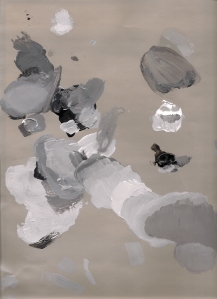
how can we use paint to match Color-Aid grayscale values? Here’s my shot at it… 

1. Since middle grays are hardest to match, I started at one end of the scale, gradually worked up to 4 levels, and then switched to the other end. I started by mixing a value and then testing it against the Color-Aid swatch before applying paint to the board. This method worked well to start.

2. Then, working my way in towards the middle, beginning with a value, I experimented by adding light or dark paint.

3. The approach still didn’t give me the results I was seeking, so I began to mix an approximately matching value and applying it directly on the board. It took a couple of tries, but eventually the lights and darks blended for a closer match.

4. The real insight in the process came when I  realized that I had 12 steps on the greyscale instead of 10! Once the extra two middle grays were cut out, bridging the lightest and darkest four swatches went very well.

5. I concluded that any of the approaches I tried worked, but the best and fastest results for me would be in a combination of 1 & 3.

Some comments & observations on the process… 

– painting in layers is helpful. Since the values must relate to each other, mixing the paint, putting it down and having it fit right off is unlikely.

– the paints I was using, Golden liquid pigment in white and bone black mixed to create grays that had a bluish hue to them vs. the Color Aid swatches. I kept this in mind while making decisions.

– it is nearly impossible to avoid brushstrokes when using acrylic paints and brushes

– although one of its purposes is to slow drying, I found that blending medium didn’t help me as much as water. Water also worked better as a paint thinner.

– the glossiness of the blending medium and the type and intensity of environmental light played at least a small role in how the values were judged.

– squinting helped